Maternity photos like a painting for this female artist
The inspiration
Her own art.
Creating images that mirrored her beauty in pregnancy while also seamlessly integrating with her own work as a painter and artist.
The backdrop
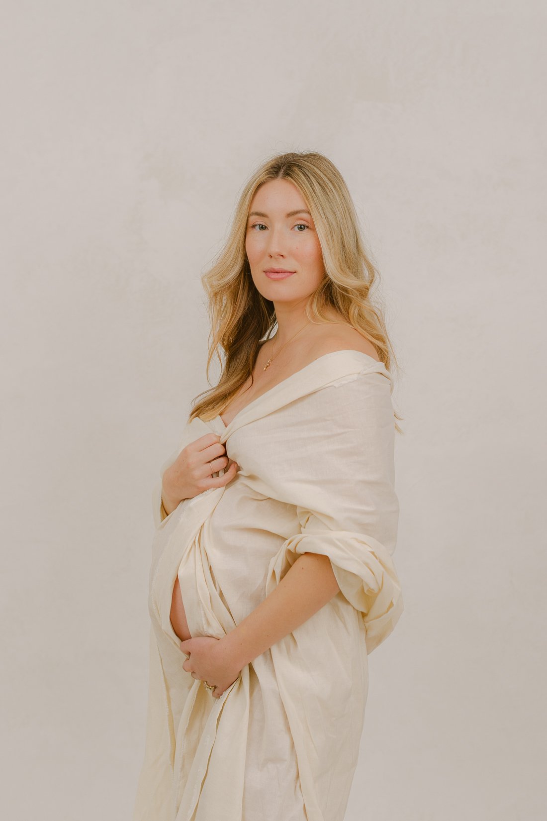
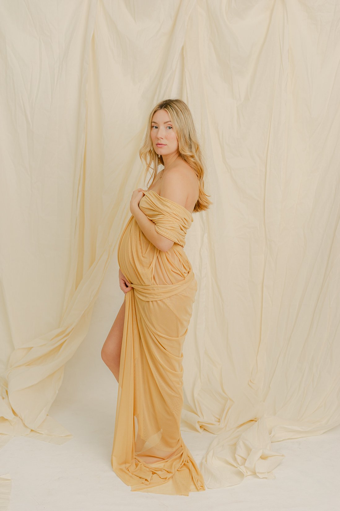
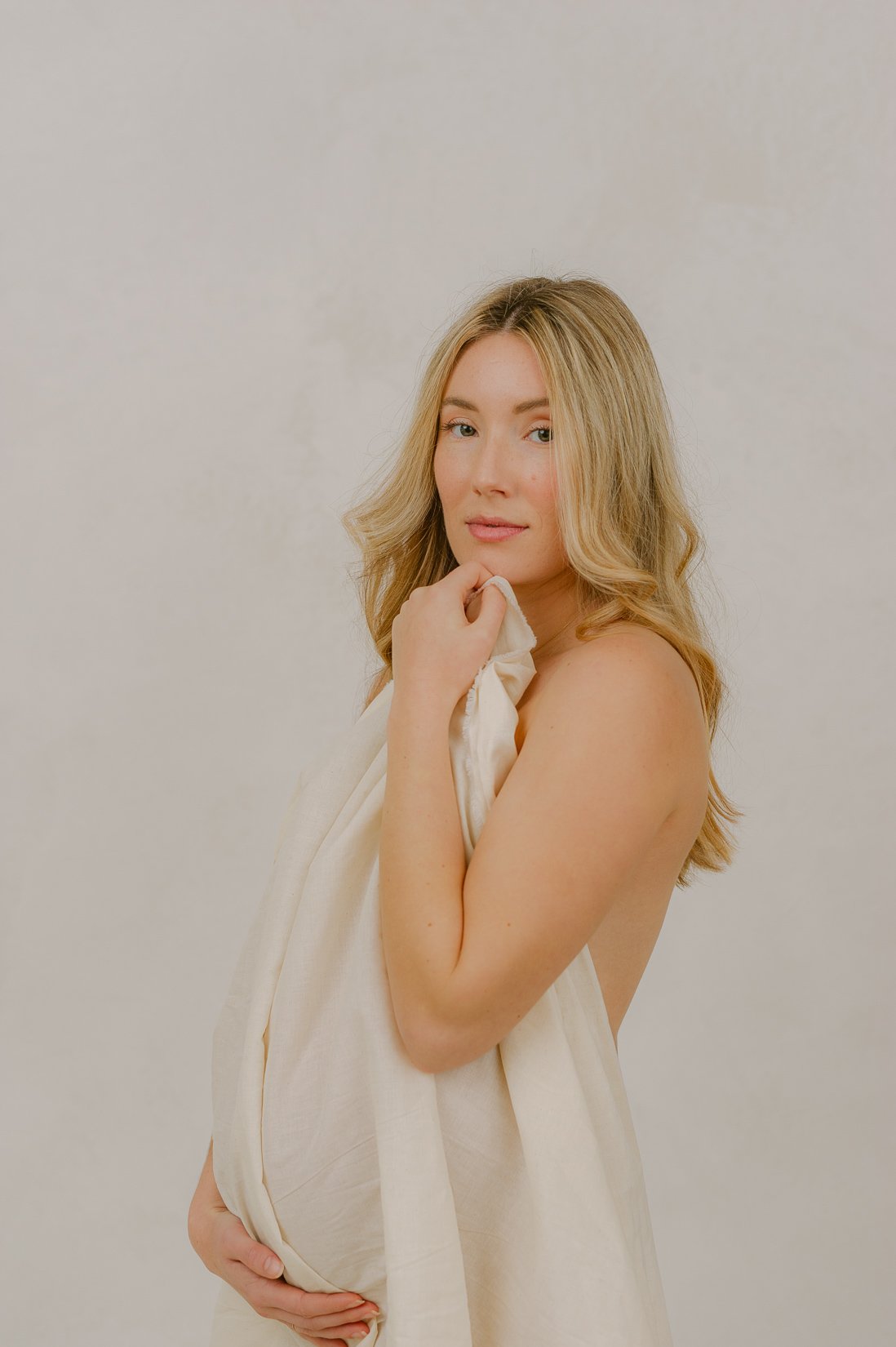
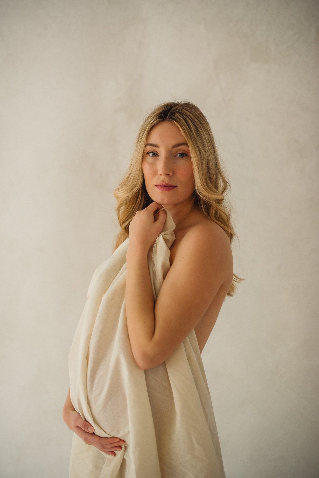
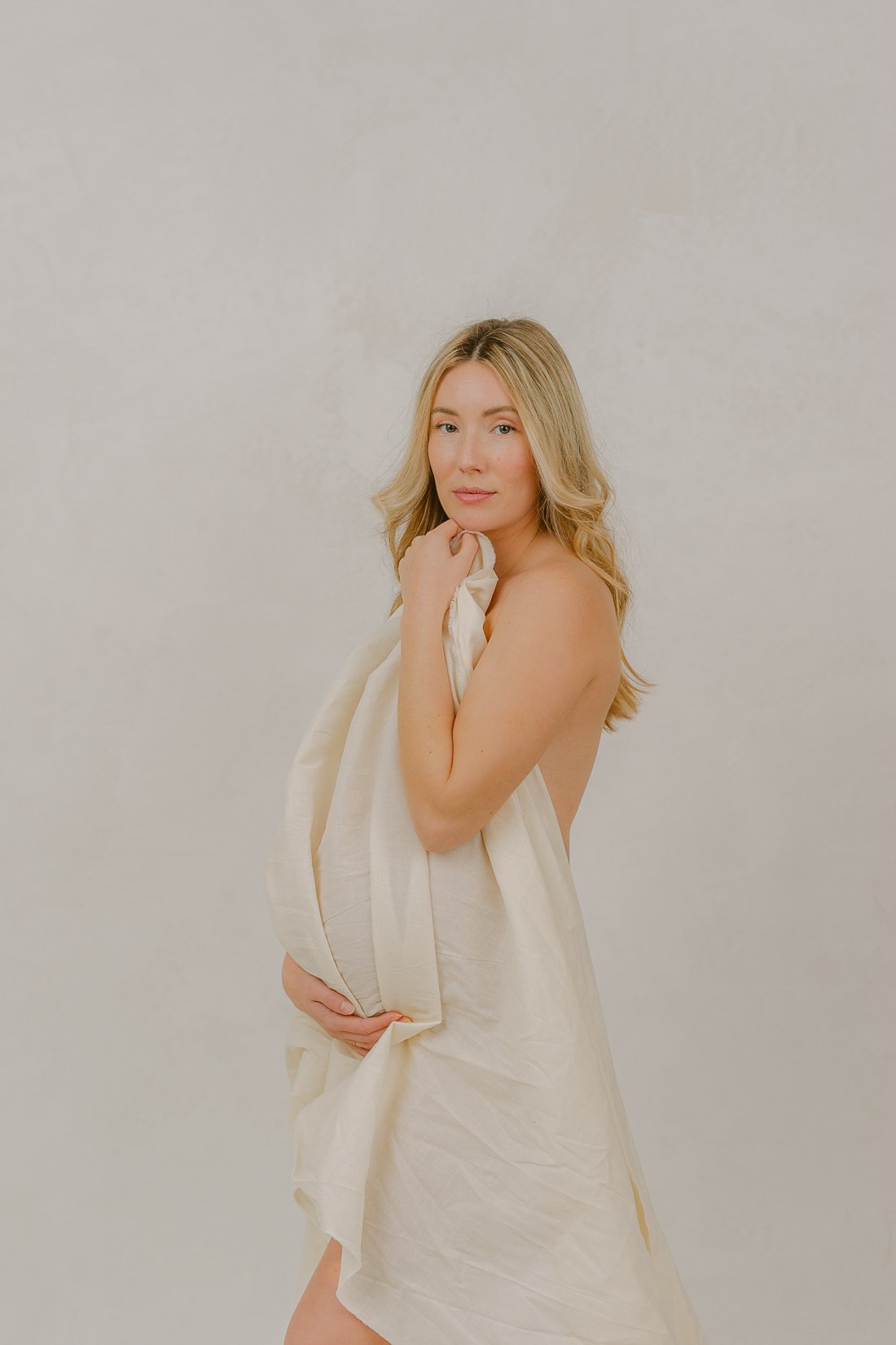
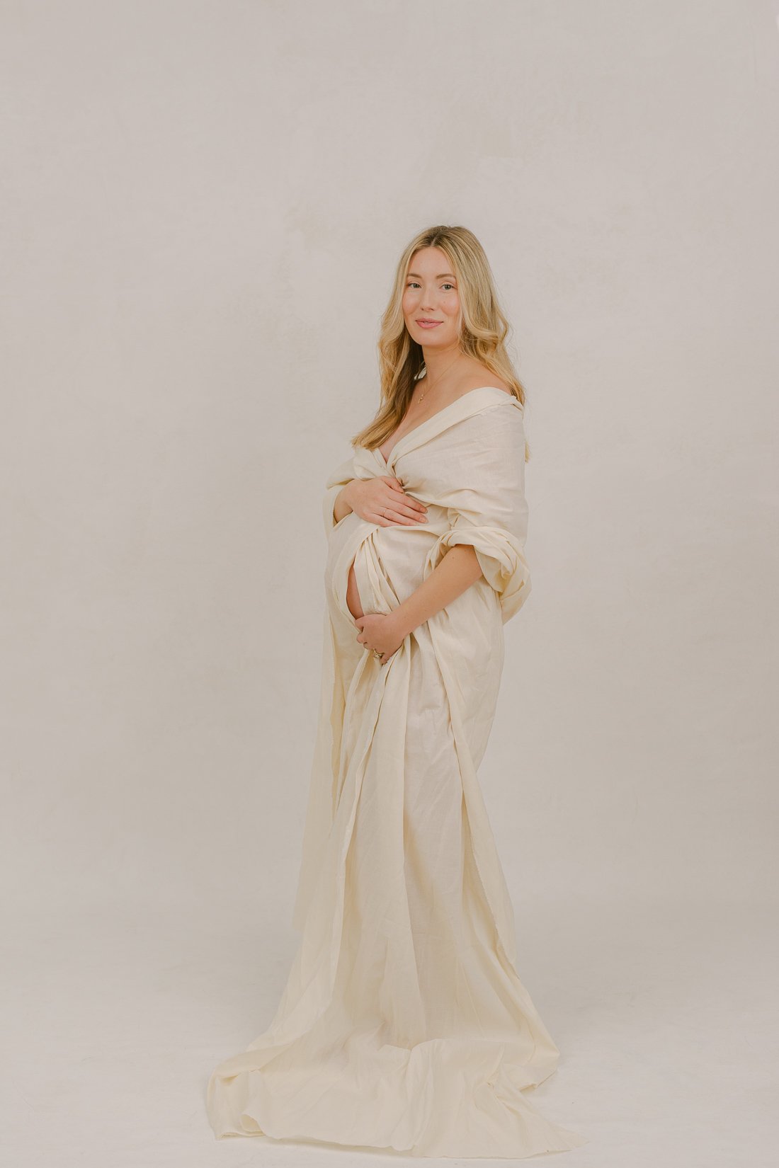
We chose my lime washed ivory backdrop to use as the jumping point for all of her photos. Keeping in line with the “fine art” theme, the lime wash added the most beautiful texture that, at times, emulated plaster. This kept a consistent look to all of her images no matter what lighting or layering techniques we wanting to switch up. From there we either let the backdrop stand alone or added in fabric for more texture and intrigue.
The lighting
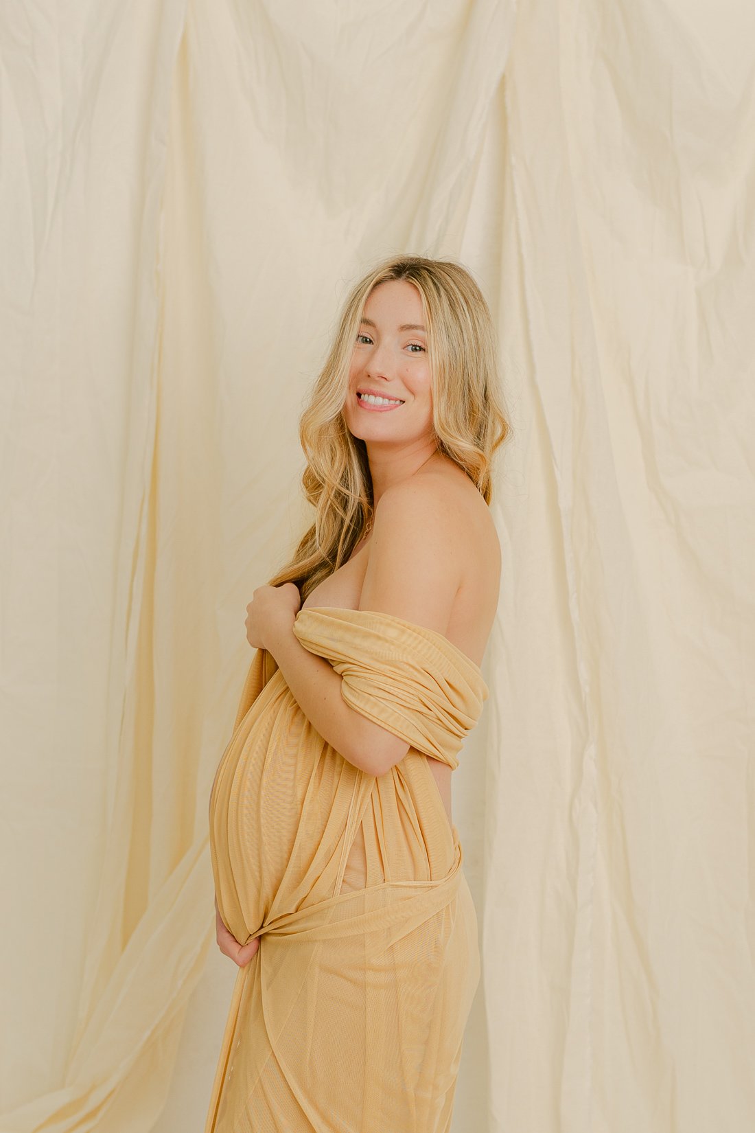
I used two different lighting techniques - natural window light and off camera flash light. In order to get a “painted” look in her photo, the natural light was perfect. It was a cloudy day and I had a little sliver of bright coming in from my studio window. This gave a classic, textured look to the image you see above on the right. Then for another mood, I used my Profoto flash for a more modern, even lighting look. I love how the different light sources create these two beautiful moods - fine art and modern.
The wardrobe
We used two pieces of fabric to create a couple of different looks.
For the first look, I hung the same muslin fabric that we then also used to wrap her with. Almost as if she was a live representation of the canvas. Then, using the same wrapping, she pulled it up and over her front with just a clean backdrop behind her.
Our second outfit was made from a warmer toned fabric draping for a more playful and layered look.
